Decorating with colours takes a little know-how but really doesn’t have to be intimidating. Here are the basics of colour combinations:
Primary colours
Primary colours are pure colours that cannot be created by mixing other colour combinations. They include red, yellow and blue.
Used singularly or in combination they are very solid and bold colours and can be incorporated successfully into your decorating scheme with good results. They can also be mixed with black or white to adjust the tint or shade of the colour.
Secondary colours
Secondary colours are created by mixing equal amounts of two primary colours. Secondary colours are green, purple and orange. If you find the idea of orange or purple walls to be too overpowering then consider their more subtle shades like peach and lilac.

Tertiary colours
Tertiary colours are an equal mix of a primary and its closest secondary colour: blue-green, yellow-green, red-orange, red-purple, and blue-purple. These colours can be combined for a very elegant effect.
Monochromatic colour schemes
A monochromatic colour scheme is one that uses a single, often bold colour, with only white or another neutral colour. These combinations are often used in home offices or teen bedrooms.
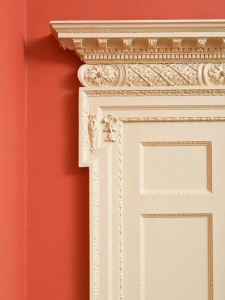
When is white, white?
As strange as it may sound white is not always, simply white. In fact there are more than 175 different shades of white including brilliant white, pearl white, timid white and lambskin, not to mention all the whites with a hint of other colours.
To complicate the matter further, many of then have names that are far from revealing like baby’s breath and cotton balls. If you are matching with shades you already have in your home take paint chips with you so you can get the closest if not perfect match.
Colour and Mood
Whether you realise it or not, colours influence your life emotionally and can create a wide variety of moods. Studies show that while some colours brighten your mood and others help you relax, some colours can even stimulate your appetite.
Here’s a guide to colours and their effects on your mood:
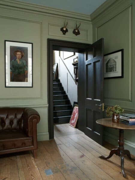
So abundant in nature, green has a soothing and calming effect. This is a great colour to use in the bedroom
F&B Vert De Terre
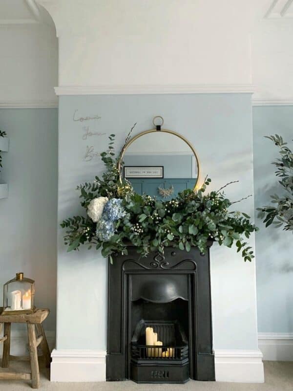
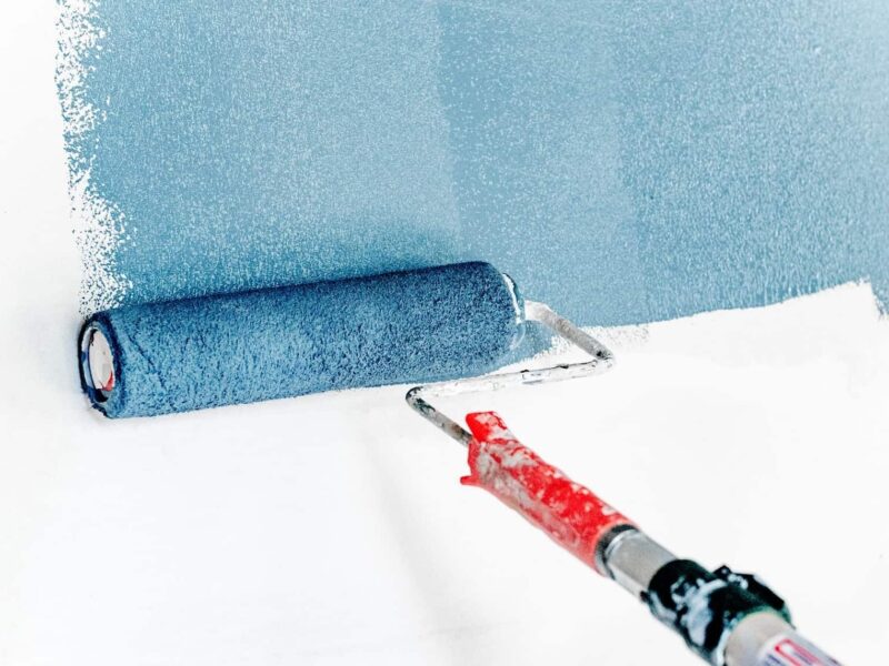
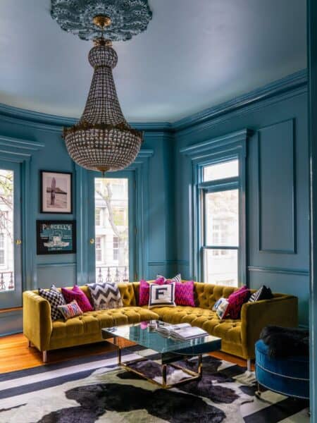
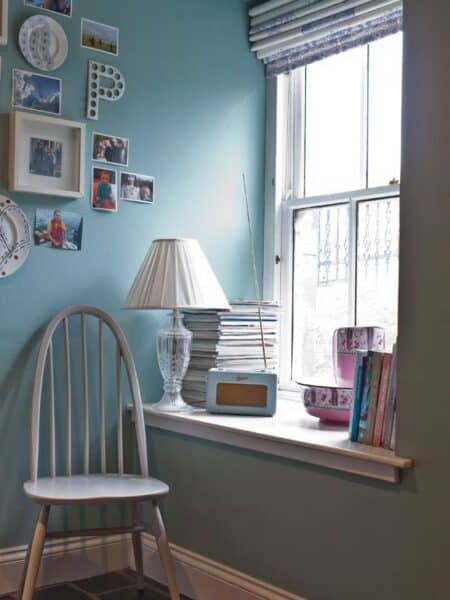
Blue is another very popular colour that as a calming effect. It is also said to help lower high blood pressure
F&B Borrowed Light
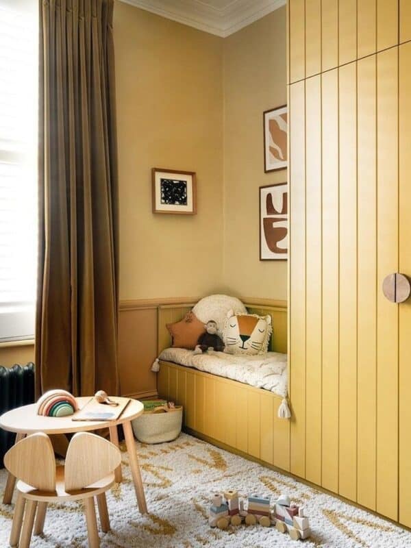
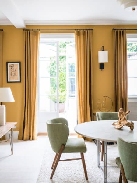
Yellow is uplifting and can help improve memory and concentration which makes it a good choice for a home office. Studies show however, that babies cry more often, old people may become more agitated and couples fight more in yellow rooms
F&B Hay

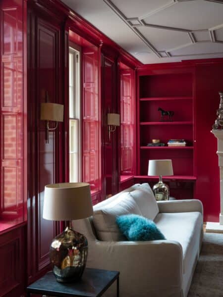
This intense, aggressive colour can raise blood pressure. It can also increase your appetite and stimulate conversation, which makes it perfect for the dining room.
F&B Book Room Red
Pink is supposed to be able to calm aggressive people, although, according to studies, the effect may only last for 20 minutes at a time
F&B Setting Plaster
See Also